Your brand colors are doing more work than you think

Color does the talking before your words ever do. Before someone reads your copy or understands your offer, color has already shaped how they feel about your brand. The right color palette builds trust, sparks emotion, and influences decisions.
Why do colors matter in branding?
Colors create emotional responses and set expectations. They help communicate your brand’s personality without saying a word. Bold colors can feel energetic and confident, while softer tones may feel calm, approachable, or refined. When your color palette aligns with your values and audience, it strengthens your message and makes your brand more memorable.
How many brand colors should a small business use?
When it comes to brand colors, most businesses don’t need a large or complicated color palette. In fact, simplicity often leads to stronger, more recognizable branding. While there isn’t a magic number, the sweet spot is typically 3-5 colors.
This usually includes:
• 1-2 primary colors that represent your brand. These are used most often.
• 1-2 secondary colors to support and add variety
• 1 accent color for emphasis, calls to action, or highlights
How color builds consistency and recognition
When you consistently use the same colors across your website, social media, packaging, and marketing materials, your brand starts to stick. Those colors become visual shortcuts, and over time they feel familiar, comfortable, and unmistakably you, helping your brand feel intentional and worth remembering.
Color isn’t about rules — it’s about intention
There’s no single “right” color for every business. What matters most is being intentional. Your colors should reflect who you are, speak to your ideal customer, and support the experience you want people to feel the moment they interact with your brand.
Why fewer colors work better
Using too many colors can make your brand feel inconsistent or cluttered. A focused color palette helps create clarity, strengthens recognition, and makes it easier to stay consistent across digital platforms.
Consistency matters more than quantity
It’s not about how many colors you choose — it’s about how consistently you use them. Repetition helps customers recognize your brand faster and builds trust over time. A well-chosen, intentional color palette, used consistently, will always outperform a large collection of colors used without direction.
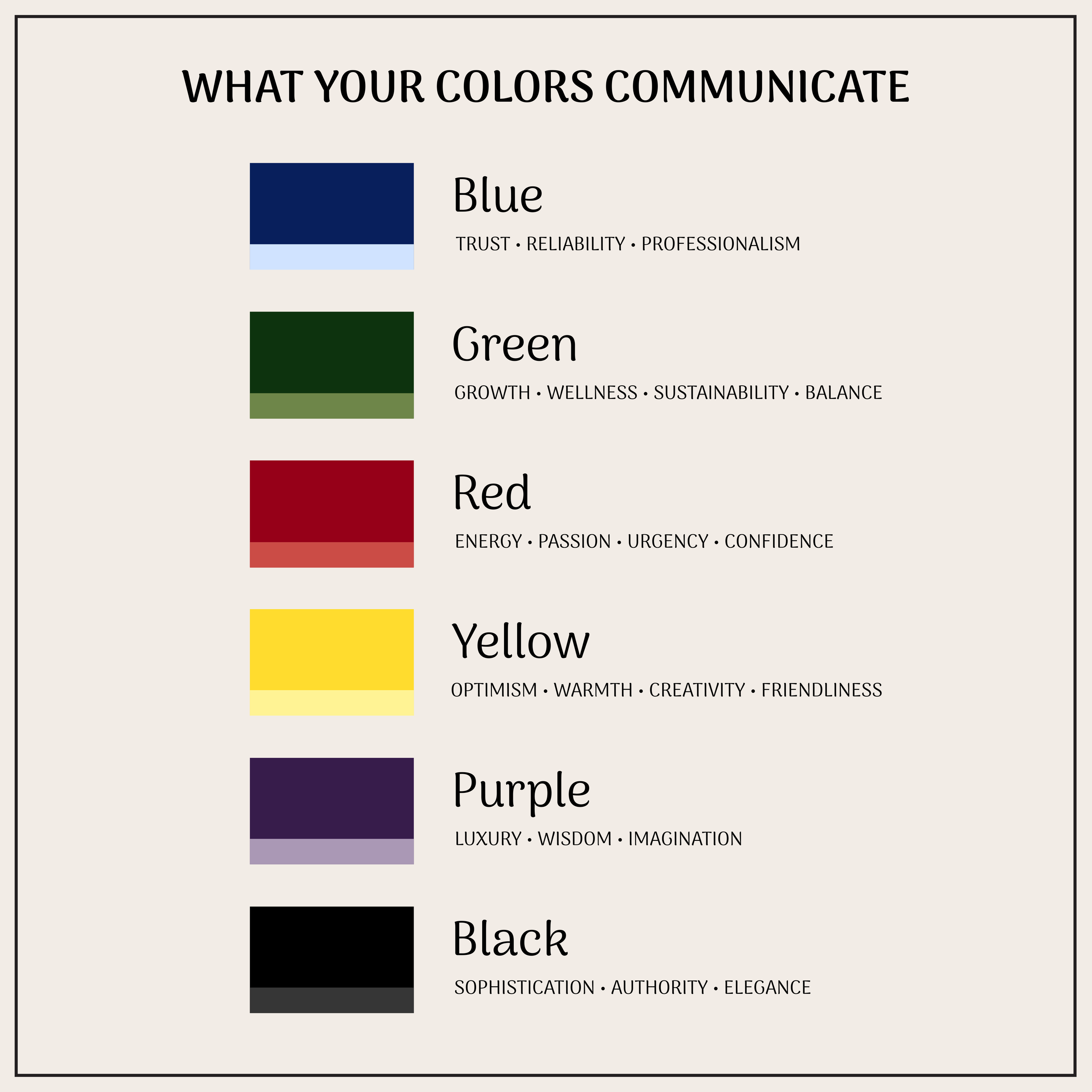
What do different colors typically mean?
While color perception can vary by context, certain associations are widely recognized:
• Blue: Trust, reliability, professionalism
• Green: Growth, wellness, sustainability, balance
• Red: Energy, passion, urgency, confidence
• Yellow: Optimism, warmth, creativity, friendliness
• Purple: Luxury, wisdom, imagination
• Black: Sophistication, authority, elegance
• Neutral tones (beige, gray, white): Simplicity, clarity, timelessness
The key is choosing colors that support your brand story, not just what’s trendy or visually appealing.